How to make graphic design accessible
‘Designing for accessibility’ means being thoughtful to the needs of your users. Good accessible graphic design ensures that your printed documents and digital content are inclusive, easy to read and simple to navigate for as many users as possible regardless of their abilities.
Accessible Design involves producing graphics and visual elements in a way that accommodates various needs, making sure that information is perceivable, operable, understandable and robust for everyone who sees it. This concept is particularly important for people with visual or cognitive impairments.
Here are some of the principles and key considerations to remember when creating accessible graphic design:
Contrast: Make sure there is good contrast between text and background colours to make the content readable for people with visual impairments or colour blindness. You can use specialised software or an online contrast checker tool to make sure your designs are compliant with current AAA standards.
Typography: Try and use clear and legible fonts whenever possible, avoiding overly decorative or script fonts. If possible, provide options to resize text without loss of functionality.
Alt Text (Alternative Text) and descriptions: Write descriptive alt text for any images, charts, and graphs used. This allows screen readers to convey the information to users with visual impairments.
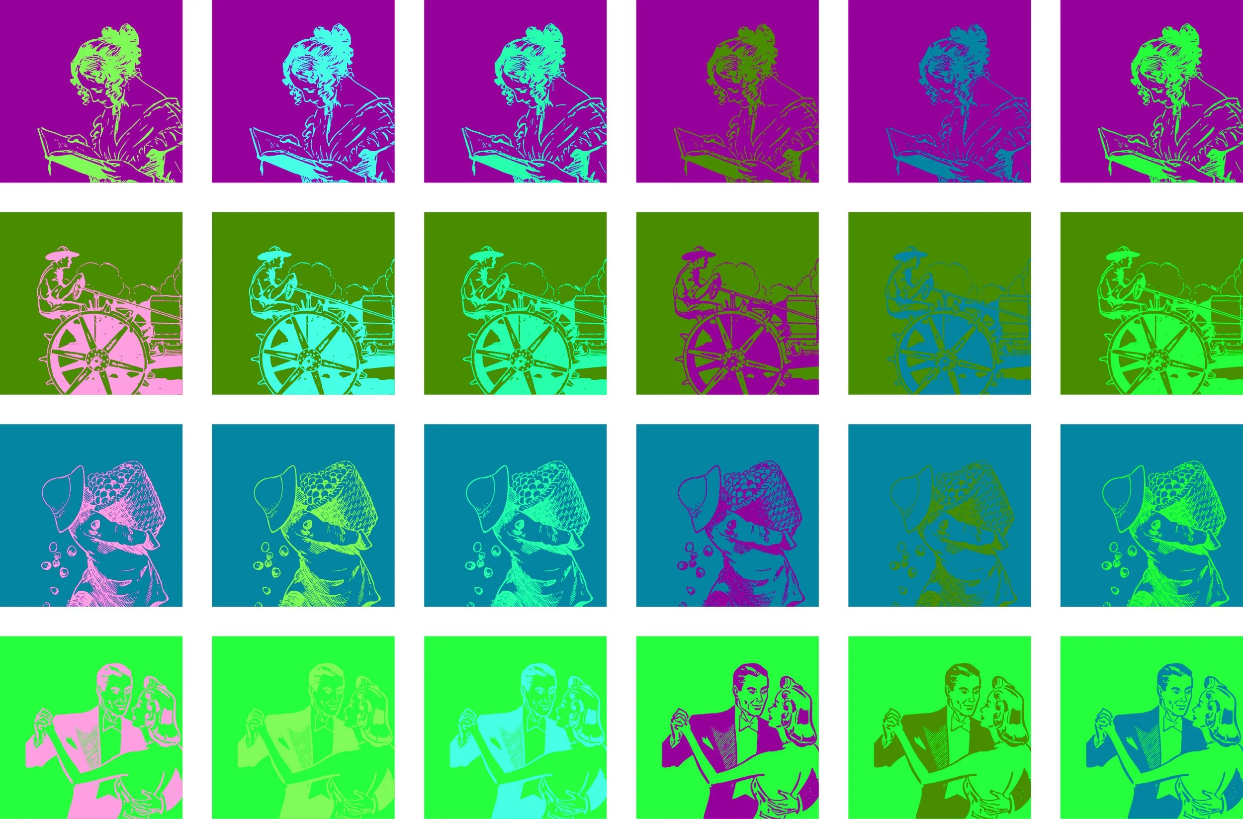
Colour usage: Avoid design that tries to convey crucial information just through colour. Use extra visual cues such as icons, labels or patterns.
Keyboard accessibility: Some individuals cannot use a mouse, so make sure that any interactive elements can be accessed and activated using just a keyboard.
Video and audio: Provide transcripts, captions and audio descriptions for any multimedia content to make it accessible to people with hearing or visual impairments.
Navigation and focus: Always aim to organise content in a logical way and make sure that any focus indicator functionality is easily visible and styled for navigating with a keyboard.
Animations and timed content: Let users control or pause any moving, blinking or scrolling content, as these type of motions can cause issues for some people.
Responsive design: Create graphics and layouts using platforms that are responsive and adaptable to different screen sizes and devices.
Testing and User Feedback: Where possible, carry out accessibility testing with actual users, to gather feedback and make necessary improvements.
By keeping these principles in mind and working them into your graphic design process, you can create materials that are more inclusive and accessible, providing a better user experience for everybody. Accessibility is an ongoing process so remember to stay updated on best practices and guidelines to ensure your designs are as inclusive as possible.
Software Tools
Adobe Creative Cloud offers several tools that can aid you in your accessible graphic design process:
Photoshop allows you to view imagery in a different of colourblindness modes, letting you check to see how colour will look for some one with either Protanopia or Deuteranopia.
InDesign allows you to bookmark, tag and order content for screen readers as well as add alt text to imagery when creating accessible PDFs or HTML documents.
Premiere Pro utilises AI to create automatic captions for video footage dialogue.
Useful graphic design accessibility links
Gov.uk accessibility blog: Dos and don'ts on designing for accessibility.
Using Adobe InDesign to Create Accessible PDF Documents (doi.gov)
reference: University of Greenwich

